If you have ever designed a website for a company or organization with a pre-established logo, you’ve probably found yourself between a crossroad. The customer will come to you because he needs to revitalize or strengthen his company’s image, and purchasing a website is one of the most cost-effective ways to do so.
The problem starts when you are given the logo to work with. There are various types of logo designs: some are mono-colored, others are multi-colored; some are based on text, some are based on a symbol and finally some are a combination of both.
In some cases, having a pre-established logo can be a God-sent gift because it can save you from the trouble of deciding things such as: what kind of font family to use, or what kind of colors should you use.
But as we all know, things usually don’t always work out so well, and sometimes what the customer wants from the site design can be contradictory to what the logo looks like. Sometimes you might come across a customer that wants a modern looking website while sticking to their “old”, 1970’s looking logo.
A good example of a contradictory design, in terms of logo/design comparison, is the New York Times website, which despite having a logo with a distinct “color”, which is black, doesn’t correspond to the colors used in the website, where black is only used to distinguish some small categories.
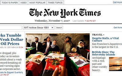
I’m not saying that their current design would look better if they were to use style, or colors, of the logo in the rest of the website design, but the contrast between tradition and technology is evident, and for this particular website, having their traditional logo might have been the proper approach to take.
When it comes to using text as a site’s identification, you probably won’t have too many problems trying to create a design that fits it, or the other way around, as text is easier to manipulate and integrate in a design than a logo.
When it comes to using a logo as the foundation, or crucial part of a design, things might seem a bit more complicated in the first approach, but there are several “nays” one might presume which aren’t necessarily true.
“the logo’s color has to be the prominent color of the design”
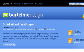
Wrong. Unless the customer specifically wants this from you, you are not obligated to use color of the logo as main color of the website. A great example of such a case is Bartelme Design’s website. What he did in it was to use a color with good contrast but with the same “strength” as his green logo.
If you are working with a mono-colored logo, you pretty much have the freedom to do “whatever you (or your customer) wants” without many risks. A good example of what kind things you can achieve with different backgrounds and the same logo are the “big” sports brands websites like Nike and Adidas.
When all else fails, or when you can’t quite integrate the logo with the design that your customer loves so much, you may also try suggesting to redesign or revamp their logo to better suit the new website.
Although that might not be an option for most customers, because it involves a bit of investment afterwards in other things that use the logo, it wouldn’t be the first time a web designer created a logo for a company. Just make sure you satisfy the customer with the design first.
Originally posted on November 8, 2007 @ 8:36 am