After the rambling that took place in August, against ProBlogger.net, David invited me once again to criticize the design of another popular blog: JohnCow.com.
I have to say that my first reaction when he gave me the link was “don’t you mean JohnChow.com?”, but after clicking on the link, and comparing it with the site that inspired it, I found it surprising that it is actually nicer to look at than the original.
I don’t mean to say that John Chow’s website has a bad design, but I think it has a very exaggerated amount of advertisement. Then again, he didn’t become a dotcom mogul by sparing on the ads.
After the initial sympathy I had for John Cow’s website, I quickly realized that it had it’s own flaws, and after the beautiful header loses it’s grace, what’s left underneath it leaves much room for improvement.
The “Pretending” Tabbed Container
First of all, the first thing that strikes the user, after looking the banner, is the list of orange buttons that feel completely detached from the rest of the design. They do not fail to look like buttons, so after clicking them the rectangle underneath them changes.
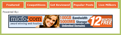
The height of the content area also changes, so that made me wonder how it would look like if JavaScript was disabled. The result wasn’t pretty…

The content you see underneath the rectangles is the content that appears individually on all of the options you can choose. And, obviously, the rectangles don’t work. Some might say “every browser has JavaScript”, and that is almost true. But whenever good web designers make a website, they usually have some concerns regarding the site’s graceful degradation, or in other words, how the site will look like if it the browser is outdated.
In terms of usability, that whole area would much easier to understand if it was design as a tabbed container. Even though they don’t look like tabs, they act like them, so common sense would say that they should indeed be tabs. Also, the selected “tab” button should have a different look from the other buttons. As it is right now, you don’t know which tab is active unless you click on it and see that it doesn’t do anything.
The Subscribe Options
Moving a little to the right we find yet another section of the website that feels out of place due to the awkward colors chosen for it’s elements.
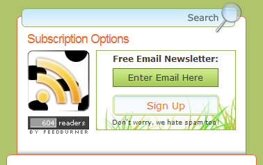
Starting from the top we have the green-outlined and blue-backgrounded search box can missed very easily unless you’re paying attention to it. The site’s background (in the container) is green, so I think that common sense would say that we wouldn’t use green as the border of an element we’re trying to make evident.
Then we have a black white and yellow/orange RSS icon, followed by a dark gray Feedburner button, next to a green and orange box. There’s nothing wrong with those elements separately, but since they’re placed so close together they should have all shared similar, or contrasting colors. As it stands, this is probably the “messiest” part of the site, in terms of colors.
The newsletter field also has a few mistakes. For example, the input field doesn’t look like an input field. This site seems to have something against making visual elements appears as they should. When you click on the input field which has the words “Enter email here”, that text doesn’t go away.
If I had to put my money on which of the two elements, the text field or the submit button, was the submit field, if it didn’t have any words in it. I’d certainly say the button was the text field. It has most of the visual elements that we’d expect from a text field: a very light background, a light border and even a slight indentation.
Sidebar Links
Moving down, and past the six ads, of which I don’t really have anything to comment upon, we have a few lists of links, and those have two problems. First, they have the same color as the color of the text in the articles. Secondly, the font size is bigger than the text in the articles. Once again, this breaks the consistency behind the whole design.
The Articles
In the articles, we find another coherence, and usability, flaw. The title of the articles has a different font that is found nowhere else on the site. I didn’t check this, but from a quick look at the top part of the page, I can see three different font faces, which once again (say it with me people) breaks the site’s consistency.
The article’s text has a justified alignment, which does in making the content feel very organized. But for a content driven website, article texts should never have a justified alignment because it makes reading the articles very tiresome because your eyes have to adapt to the space between each word on every different line.
The Header and Conclusion
Thankfully, the critiques end here with the header, and that ends up being one of the most pleasant parts of the site.

Personally, I find it a damn shame to see a design that starts off so well at the top turn into a mess during the middle. The header of a website is, for most modern designs, the most important design element, which will define whether the content is of a high quality or not, and JohnCow.com’s is great.
If you want to do a bit of homework, you can visit John Chow’s own website and look at how he implemented a similar type of content, with even more advertisements, without breaking the site’s consistency.
Originally posted on October 18, 2007 @ 8:38 pm