What I am going to say is probably not going to be some people’s favourite thing to hear, but I believe that all the best designed WordPress themes come from one designer: Elena of Design Disease. I have worked with her for around two years now, and while she might not work with a grid or any of those other “designer” conventions, she works around advertising sizes, and has a special style that I am enamoured with.
Even if you just look at the free themes she has released for WordPress, I think you will be amazed at her work. While it isn’t always the most flexible for adding your own personal style, they are all very beautiful themes.
InSense is a two column design with rounded corners and a distinct blue colour scheme. It allows the user to switch from a narrow version to a wider version, but I think the narrow version has the better line width, and thus is easier to read.
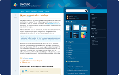
Illacrimo is a three column theme with another distinct blue colour scheme, this time the design is very different, though many of the elements are positioned the same. This is by far one of my favourite WordPress themes, though probably the most difficult to shift towards a personal preference design-wise.
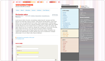
Smashing Theme is a three column theme that has many of the same design elements and influence as Illacrimo, but this time with an orange colour scheme, and some very different graphics. It was created for Smashing Magazine, hence its name, and is very nice to look at. I like the way the different content sections in the first sidebar have different colours, and how icons are used very sparingly on this theme.
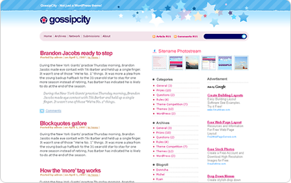
Gossip City, or really, Gossip City 2, since Elena didn’t like the first theme, and started again from scratch, is a three column, header heavy theme, that is much easier to modify than most of her other themes, as it keeps the content area very clean, using many less graphics than some of her other themes. The theme was created for the growing celebrity blog niche, and has become quite popular in that and other arenas.
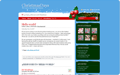
Christmas Days was Elena’s first attempt at a seasonal theme with blue, green and red combined, I think she really pulled off the feeling of Christmas. She had some interesting design challenges when finally releasing the theme to make sure that it was easy for anyone to just drop into their themes folder to use it right away without having to customize any images.
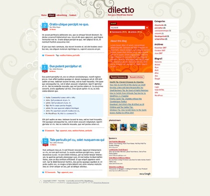
Dilectio is her most recent free theme is another one for Smashing Magazine, this time, the design is again mainly orange for its colour scheme, but has a very natural vine-like feel to it, as swirls of colour are everywhere in the design. It is three columns, and has a nice wide first sidebar for putting all sorts of content like your Flickr stream, about details, and recent posts and comments.
Not only has Elena of Design Disease released all of these wonderful free themes, but she has also done numerous blog designs, including this one you see today on eXtra For Every Publisher. Another fine example of the type of WordPress theme design ability that Elena has. I am always amazed at her work, and I highly recommend everyone check out what she’s done.
Maybe you’ve seen all these themes before, but did you know they were all done by one designer? If you look through them, you can see her sense of design and style slowly shifting and evolving as she comes up with new designs. I am at the point now where I can usually tell how old a theme of hers is, just by the placement of certain key elements.
Originally posted on February 12, 2008 @ 12:09 pm