A couple of minutes ago, I was writing an article about blogging, and in the middle of it I decided to refer to Darren Rowse’s highly popular ProBlogger.net. When I visited the link to confirm it was the correct one I was surprised, and then shocked, by the new design.
Although it is much more sophisticated than the previous one, in some aspects the design leaves a lot to be desired and, dare I say, makes a lot of mistakes in terms of usability. It wasn’t an easy decision to choose to write this article, but I decided to do it as an example that even great names can sometimes make mistakes.
One of the most basic rules about interface design, is that when a person is visiting a website, or a new program, there will always be four simple questions that cross our mind: Who? What? Why? and How?. When one of those questions is unanswered, we start to lose focus on what’s in front of us, and when that happens, people tend to start getting loss in the interface.
If you are relatively tech-savvy, you’ve certainly witnessed this sort of behavior a few times, like, for example, when you try to explain to someone who isn’t experienced with computers how to work with an application that is (supposedly) easy to work with, like an e-mail client. I know how many times I’ve had to try and explain my father how to check his inbox. Although the old Problogger design had quite a few limitations, like for example:
- it gave some key articles a lot of focus;
- it gave other articles very little focus;
- finding an article in the archives wasn’t as easy;
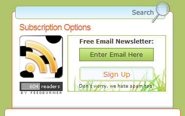
There were some other aspects that that designed achieved very well. As soon as any person came to the webpage, not only did he instantly know where he was, but he was already answered to some of the most basic questions that someone might want to know about like, for example, “What is a blog?” or “How blogs make money online”. Which was all thanks to the “Introduction” square which was correctly placed underneath the banner and the tagline, as you can see in the screenshot below.

Despite sometimes having some very technical content, the site was very user-friendly, and it made even the most inexperienced Blogger want to learn more. It didn’t feel like some Elitist website where only those who are very familiar with the subject are welcomed. The new design fails in all of these previous aspects.
Top of the Page
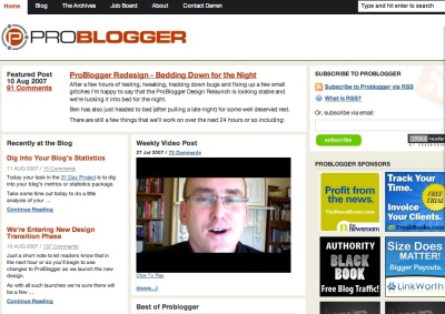
On the new design you are greeted with non-intrusive links at the top, which say nothing about the content itself, a banner, the latest article, different ways to subscribe to the website followed by a huge amount of content. If I were to change this top part of the website, I could include a similar, or identical, tag line to the previous one. And then I would address another issue that hurts the whole site in general: the font size.
Font Size
One of the most stunning technological achievements that we’ve been witnessing lately, in the computer industry, is the number of pixels we are able to fit in the smallest of screens. A good example of a gadget with an amazing number of DPI (dots per inch) is the newly released iPhone which can display 160 pixels per square inch. What I’m trying to say with this is that the mediums that which use for internet browsing are changing.
Every year a new device comes out with a better resolution than the previous one but with almost, or exactly the same size. In Japan, people already have cellphones with a resolution twice as big as the iPhone’s. But this isn’t an essay on that, this is about ProBlogger. And one of the things that is bad about the design is that the overall font size is too small by today’s standards.
Left Column
Moving below from the top section, we are greeted with three columns. The first one has a list with the title, and a small excerpt taken from the beginning of each article. The equivalent of this, in the past design, was a big percentage of the article, which usually used an inverted pyramid scheme.
Darren Rowse starts with the conclusion, or explains what the article will talk about in the first phrase, and then develops from there. It is an excellent way to motivate people to read the rest of your articles, and a technique that is becoming very common in the internet, due to how little time a visitor usually stays on a website. So this left column actually works really well. The biggest problem with it is really the lack of width and, once again, the size of the text.
Since the lines in this section are really short, the designer should have taken better care of the typography, and including a bigger space between the lines and between each character would do wonders for the legibility of the text.
Middle Column
The middle column is slightly wider than the left one, so one would assume that it’s content is more important than the left one. That may be partially true, since it does focus on Darren’s video post, and on the most popular, or personal favorites, or introductory articles (like the old design used to feature at the top). I will comment on the organization of the information, and on this section once again, when I talk about the footer.
Right Column
There’s not much to say about this column, but at the top there was a small mistake made, which some of you might have noticed, with the e-mail subscription button. In most computer interfaces we use, confirmation buttons are usually placed at the right, or bottom right, of the field we’re typing in. In this case, they placed it at the bottom left and placed the link for the RSS feed on the bottom right instead. Another thing that is noticeable, is the amount of whitespace that this section has, compared to the rest of the site (with the exception of the banner and the footer). This is the section with the least relevant information, but with the most whitespace.
Footer
Instead of simply being something that concludes the design, in this case, the footer holds more information about the site itself, and the who, the what and the why, than the rest of the design. We can find out What the author writes about in the categories, How we can make money and become Professional Bloggers, and last, and certainly not least, Who the author really is.
So, basically, most of the things that were done correctly in the previous design, we’re flipped around and sent to the bottom of the page, where they’re less likely to be seen.
What I Would Change
There is no easy way to make the design better without compromising the current changes and the new features that were implemented, but my suggestions are these:
- Improve the typography – Like Darren Rowse himself said on the video post of the 27th of July, we need to find ways to differentiate ourselves from the rest of the blogs out there. Most of those blogs suffer from typography problems, and this new design is plagued with them. But to improve typography do so in some sections, like in the left column, would mean that you’d have to change the layout considerably…
- Change the front page to a 2 column layout – the easiest way to improve the typography of the website would be to move the content of the center column to the right one and give the most recent content more relevance. Doing this would also improve the site’s whitespace considerably.2.1. A possible alternative: If getting rid of a column is not an option, I would decrease the width of the right column considerably, and possibly move the left column to the middle, having it occupy the extra space.
- Read this article again – most of the things I looked at, and criticized, can be done an infinite number of times. There is no flawless or golden-ration equivalent for a perfect design, but it’s important to question what kind of content you want to emphasize the most: the recent, or the most popular? And what kind of readers you want to satisfy the most, the new ones, or the returning ones? Right now the site is focused almost entirely on the later.
Conclusions
So what was achieved with this new layout, and the new design? Each section has a small title explaining what’s in it, but has less focus than the section itself. If this was the intention, it was well-achieved, but in terms of usability, it’s better to know what you’re looking at before you start reading it.
In three column designs, people instantly assume that the largest column is the most relevant one. Since this is the case, then that means that this design emphasizes more on the past articles than on the recent ones. If it were up to me, I would flip the left and middle column’s content around.
By sending the categories, the small picture and story, and the resource links to the bottom, the site becomes less friendly to newcomers, but easier for returning visitors to access the latest information, rather than having to see the information they had already seen in their first visit once again. This is both a positive, and negative, aspect of the new design.
In terms of whitespace, some sections are incredibly well divided in terms of space and content, like the right column and the footer. Unfortunately, the areas with the most content suffer a lot from this problem. The most important part of a blog is it’s content, period. And in terms of content, Problogger.net is very well served, but, with this new design, the links to the most recent, or featured, content are the least attractive parts of the site to look at.
In conclusion, the site is a bit easier to navigate than the previous one. Returning visitors will be able to quickly read the titles and catch up on unread articles, but newcomers will probably feel intimidated by the amount of information that is crammed up in the same place. It’s not a design that you can’t get used to, but it is a design that takes a while of getting used to, and for new visitors, and even returning ones, that is bad.
Originally posted on August 10, 2007 @ 7:34 pm